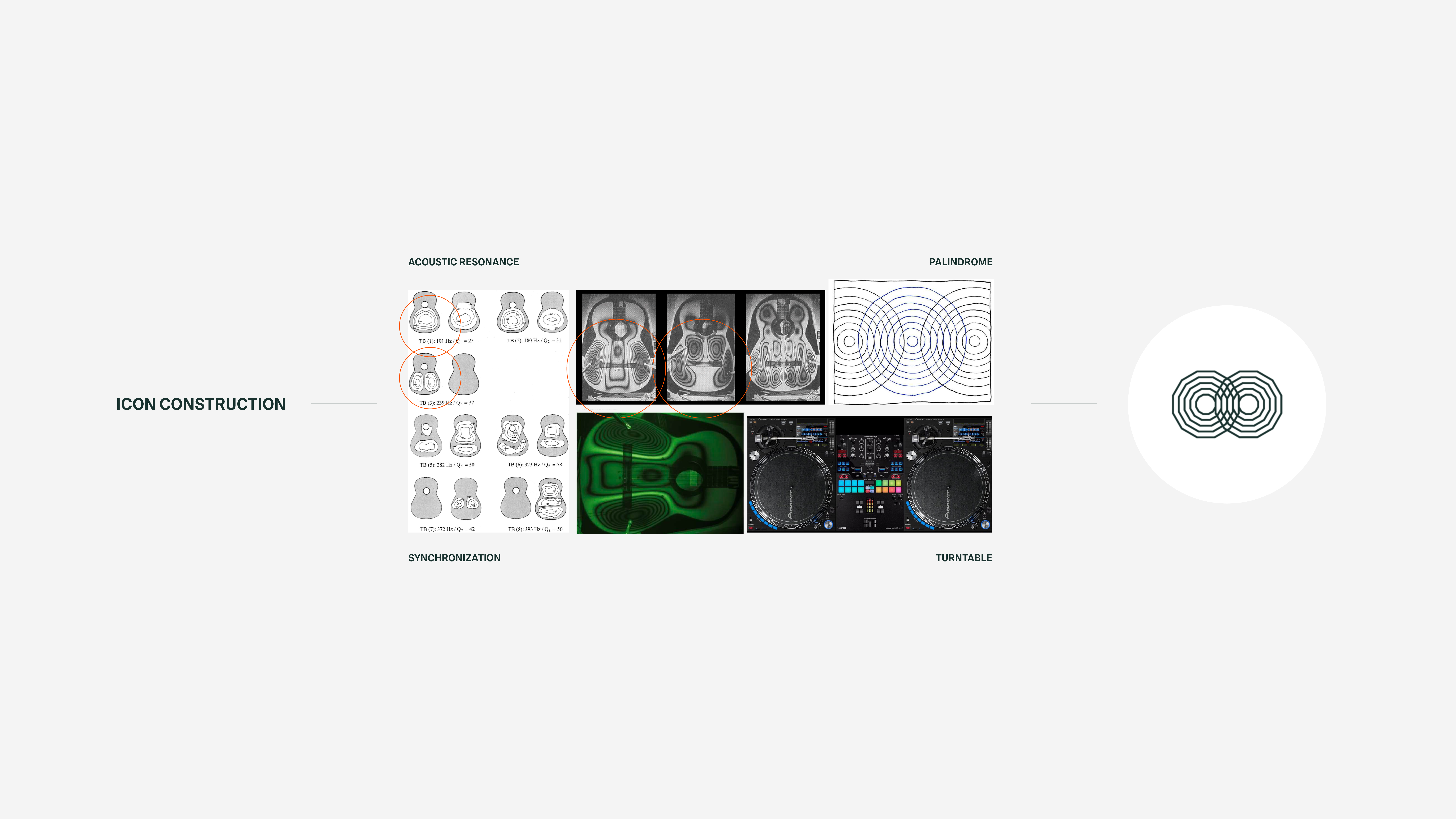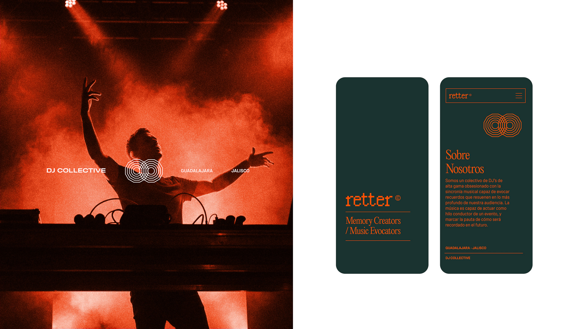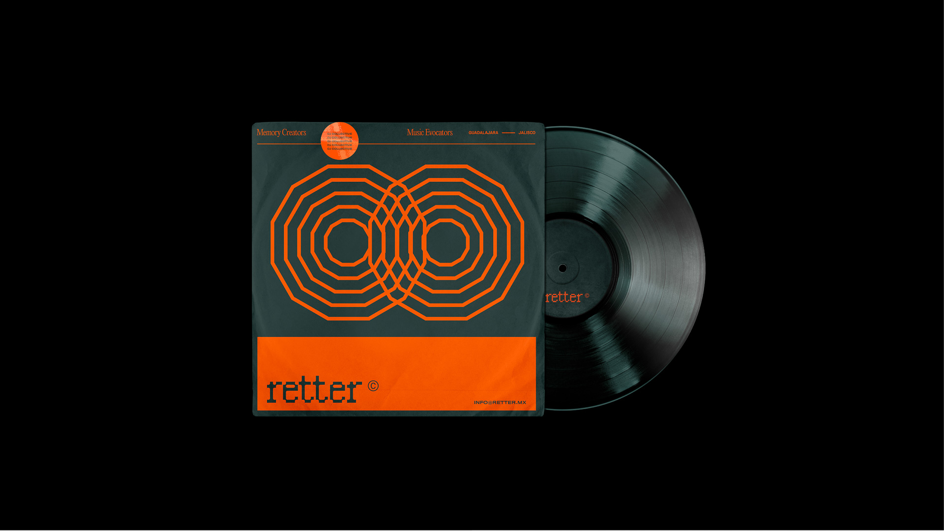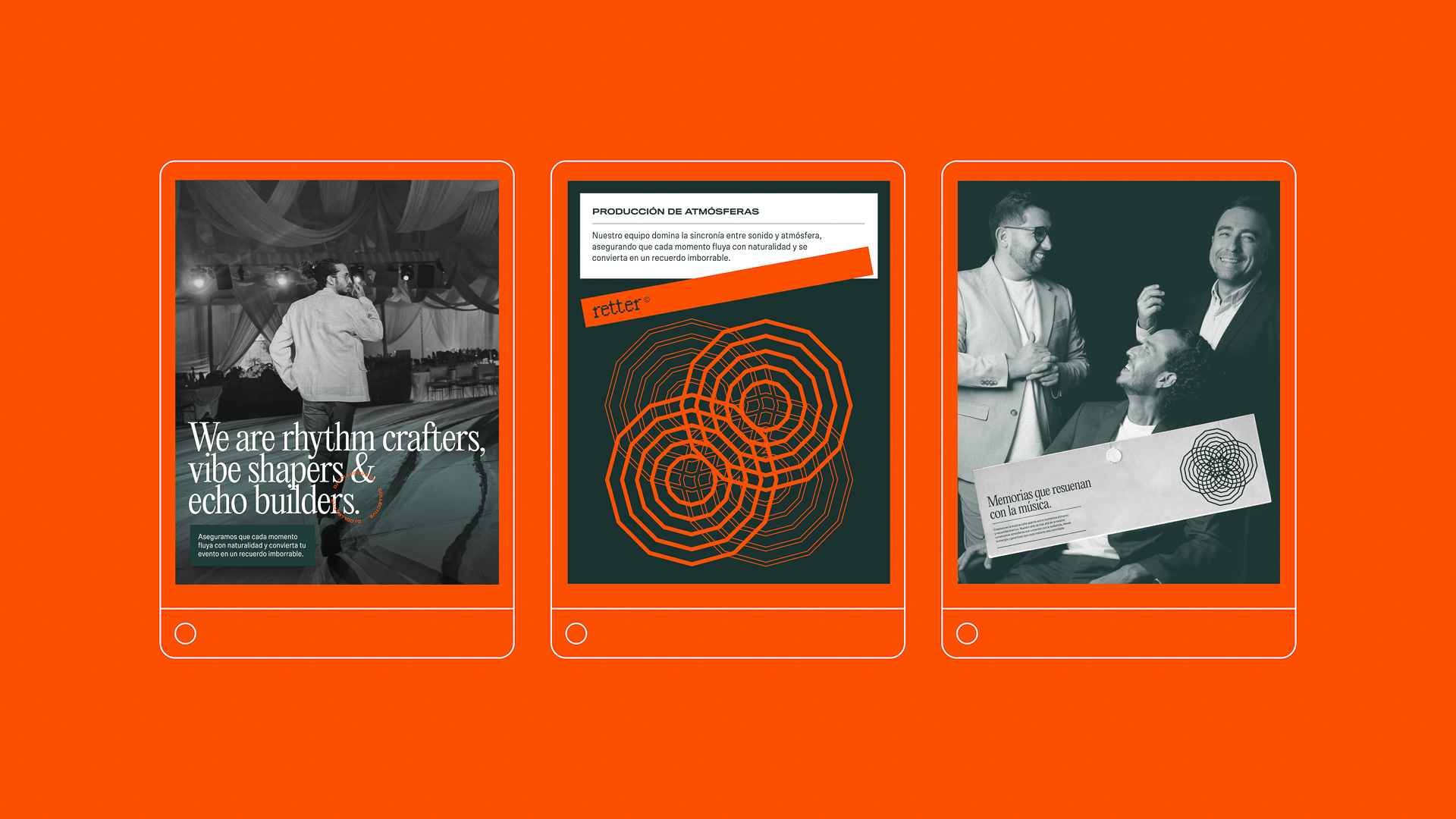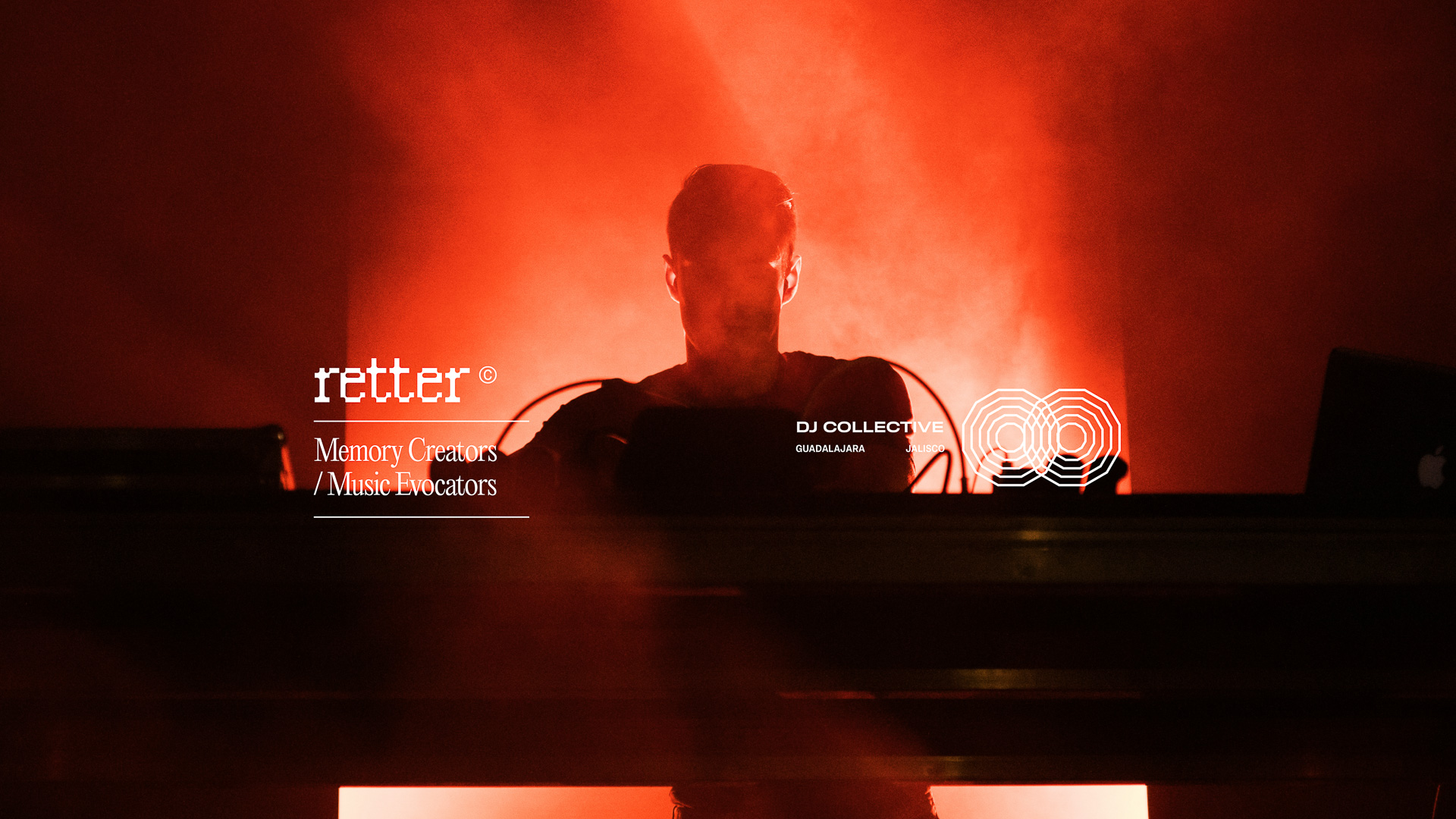
Retter is a Guadalajara-based DJ collective born from the idea of shared frequency. The challenge was to build a brand identity that didn't just look like "another electronic music crew," but instead captured the physical essence of sound: its vibration, its echo, and its power to synchronize a crowd.
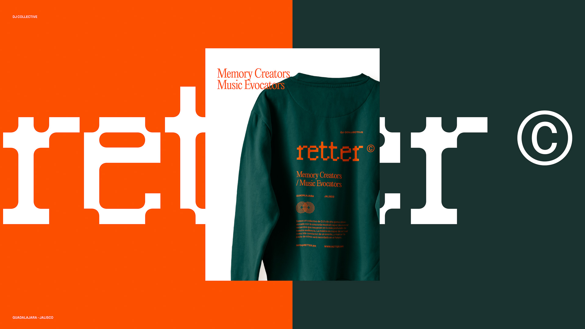
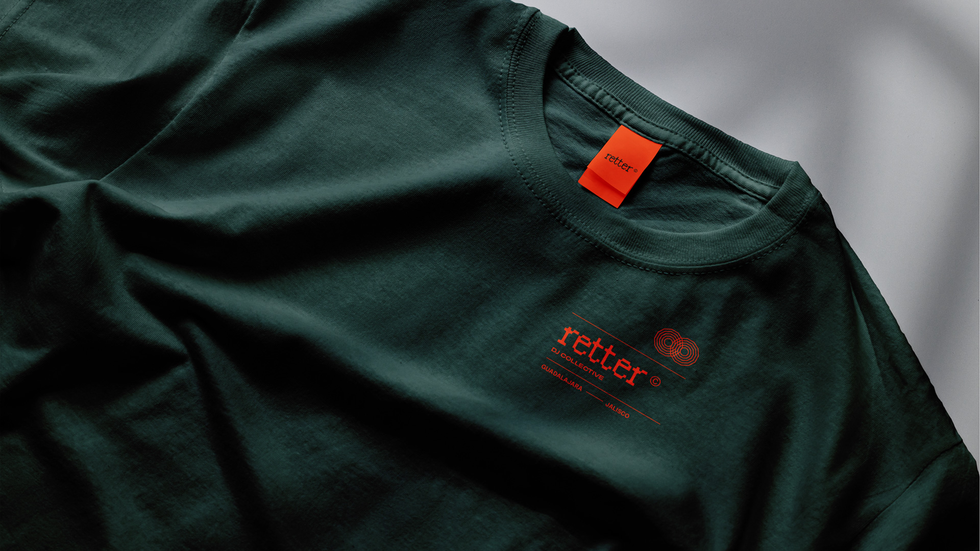
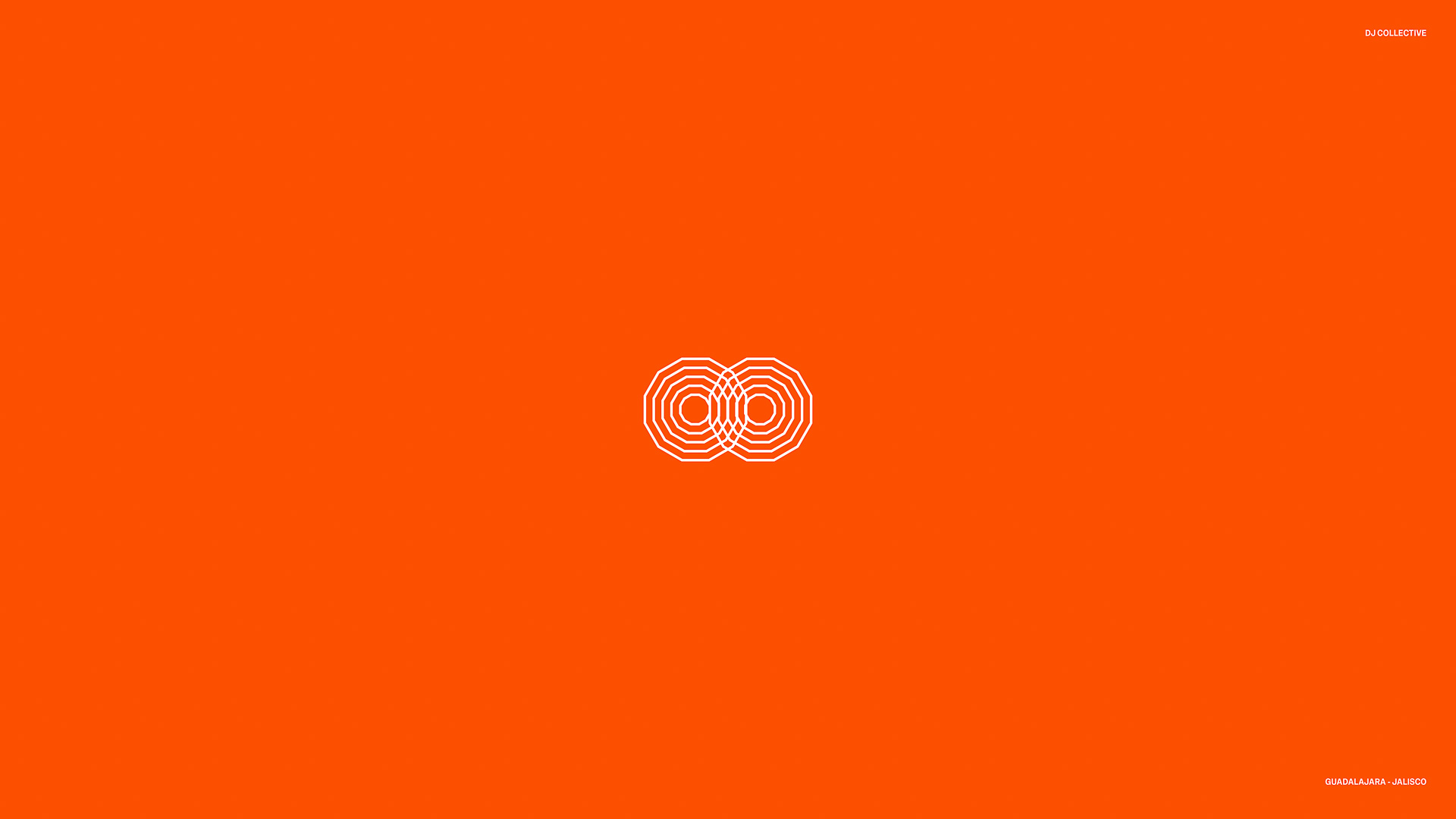
For the name we wanted something that felt cyclical, balanced, and rhythmic. Enter RETTER. As a palindrome, the name reads the same forward and backward—perfectly mimicking the concept of an acoustic echo bouncing back to its source. It is visual rhythm in its purest form.

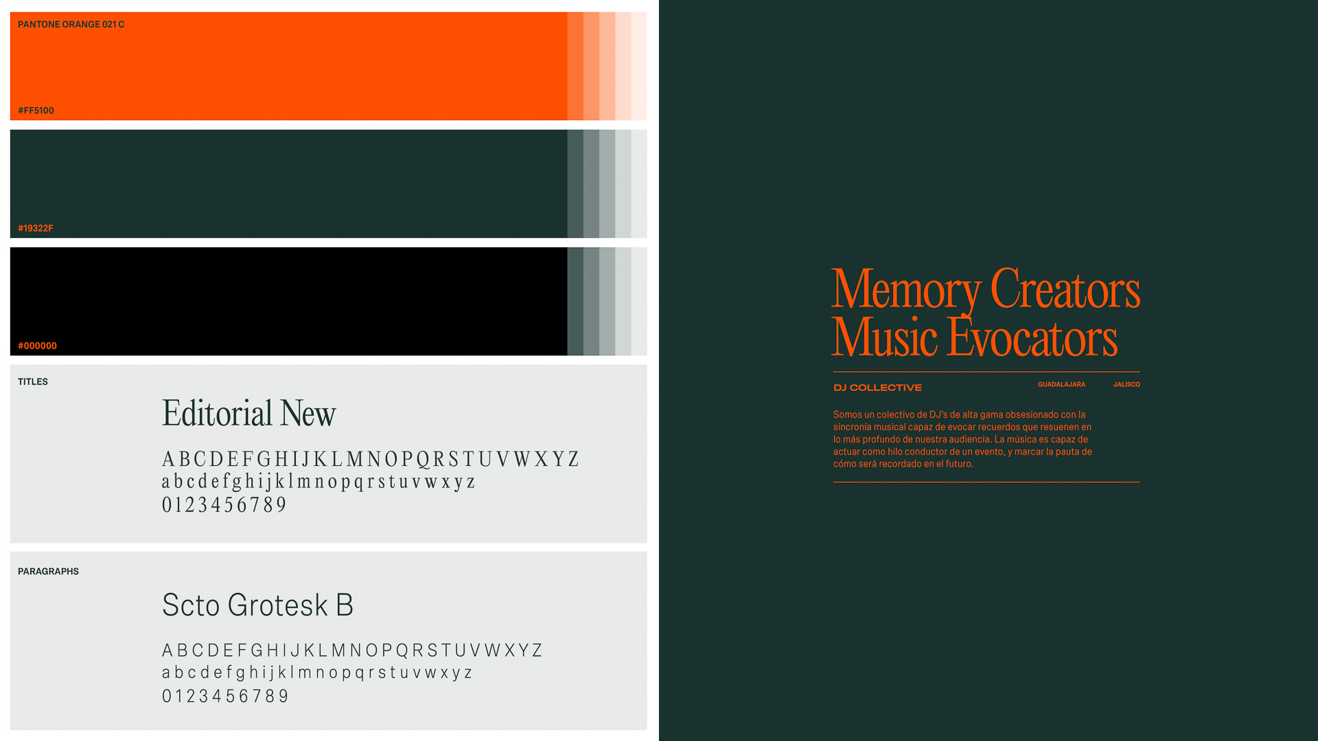
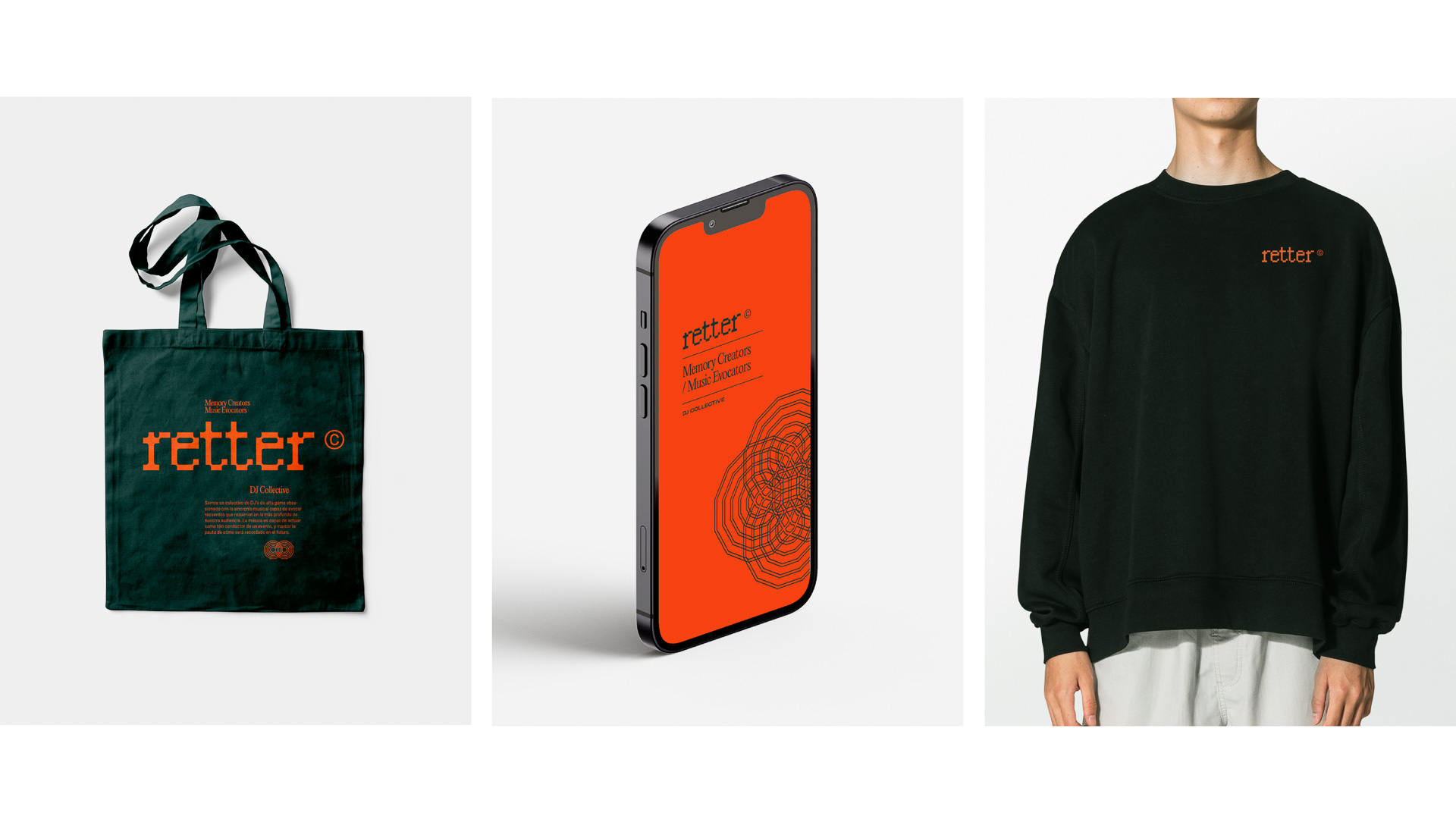
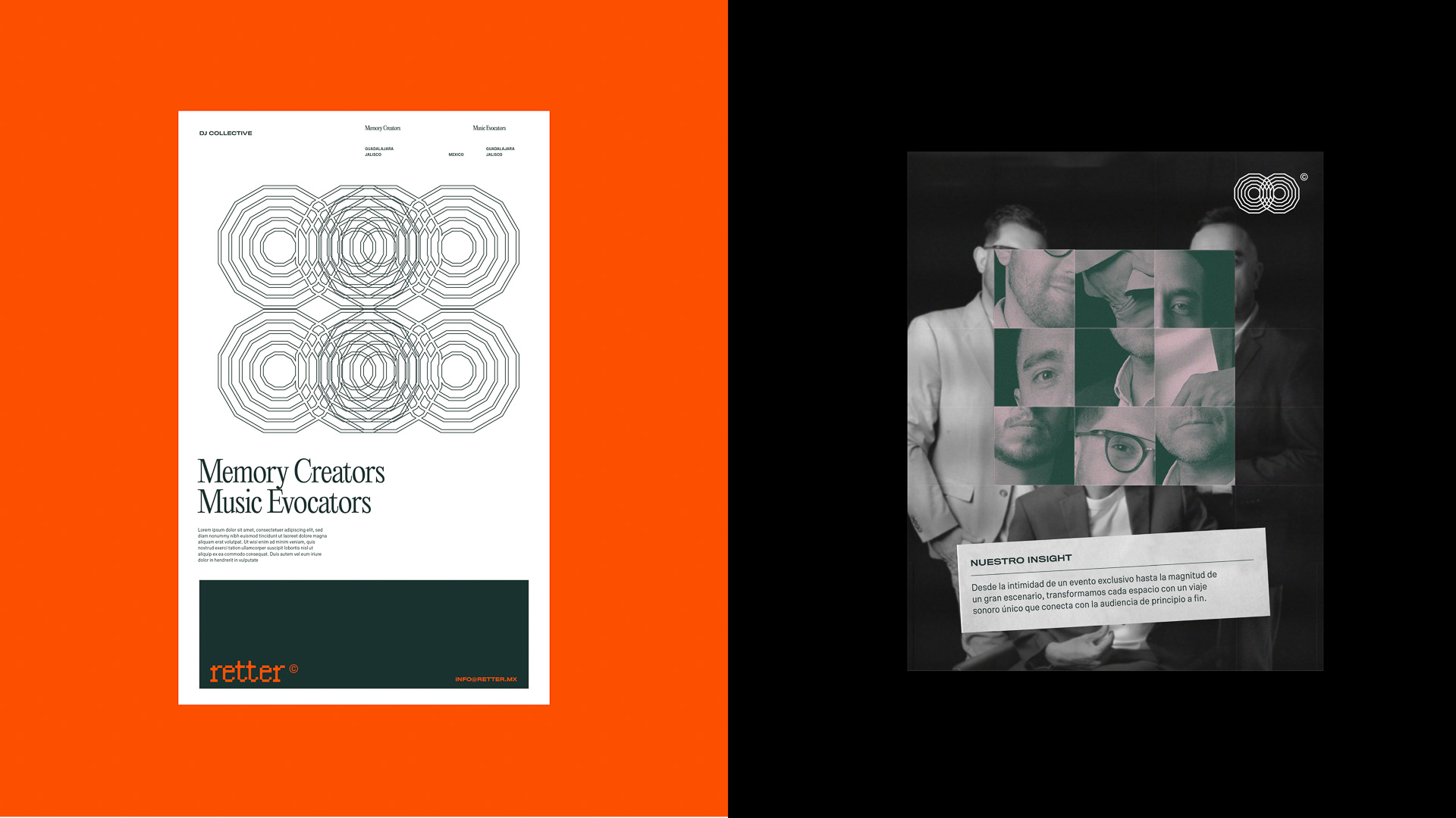
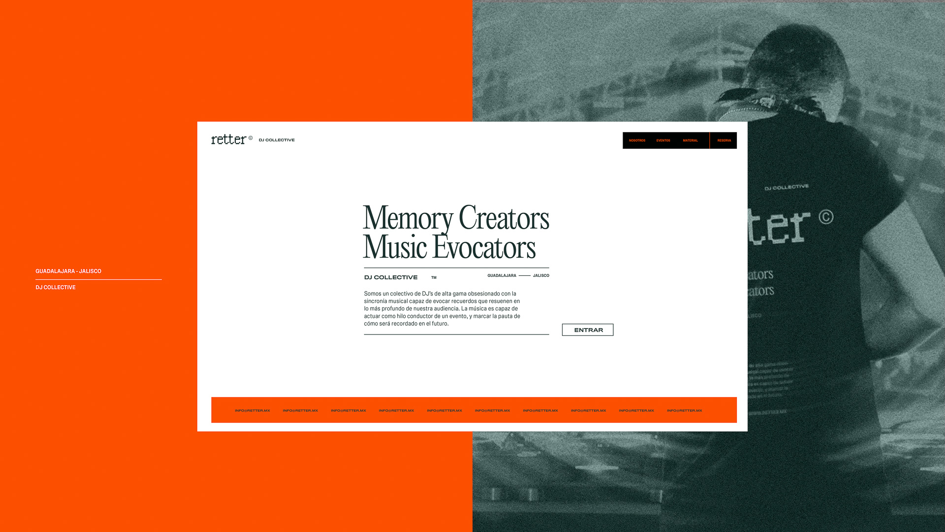
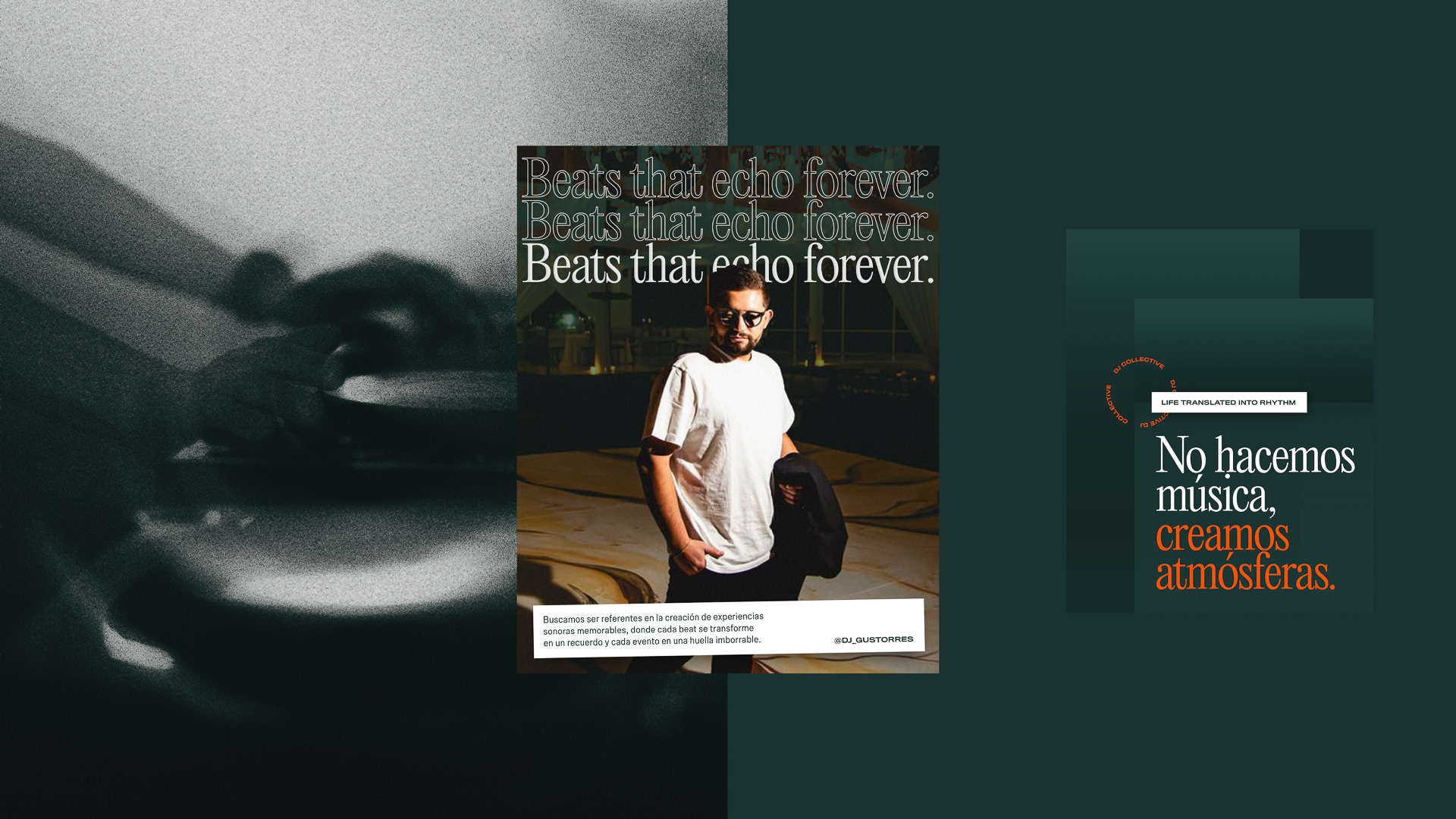
Electronic music lives in the dark, but it breathes in neon. We bypassed the safe, overused minimalist techno aesthetics in favor of a vibrant, high-contrast color palette and electric typography. The type choices are bold and kinetic, designed to feel as if they are shaking under the bass of a massive sound system.
To steer Retter away from generic electronic music clichés, we created a deliberate visual friction through typography. We paired a classic, high-contrast serif inspired by vintage newspapers with a raw, utilitarian neo-grotesque sans-serif. This intentional clash between old-world editorial heritage and clean, club-ready functionality mirrors the collective's philosophy: honoring the deep roots of music while driving a modern, high-energy frequency forward.